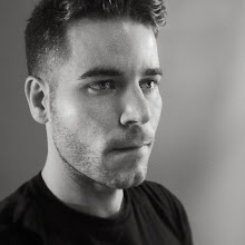
I didn't realize, until completely finishing, that the lighting on the figure is incongruent with the shadows cast behind him. Bad artist... all I was thinking about was how I compositionally wanted the shadows to fall and what it would do to the psychology of the piece. I kind of like that it doesn't match... I don't know if it's terribly obvious beyond creating discomfort within the reality of the piece.
The pose is from a Gant ad.
And, I decided to fix the new Red Haired Girl... Looking at her the day after I painted it, I realized that her hair wasn't really what I had envisioned it... the original plan was for it to be big and wild, and it ended up being quite short. So, here's an update. I think it's improved. I also think the technique is a little nicer... the hair in the original piece is a little too evenly painted. I was trying to do this a little more painterly and with some degree of emphasis and randomness.
Saturday, March 29, 2008
Thursday, March 27, 2008
A New Red-Haired Girl for a New Age.
Another model... this time, however, the only thing I'm borrowing is the pose, from the lovely Jessica Stam as featured in the April 2008 Vogue. This feels a lot more satisfying knowing that I invented the colors, the clothes, and the hair. Feels a lot like my senior thesis project, actually, just quicker and (cough) more interesting.
It is also only coincidence that this completes a trio of complementary colored paintings (see yesterday's post, and the day before that). I don't think this piece really goes with the other two. When you compare it to Daria (March 25) it looks so breezy and fun. I'd like to do something darker, though. We'll see.
AND, what's more fun is that this kind of reinvents "Red Haired Girl" for me. Just a little over a year since. Maybe every winter I can do a new Red Haired Girl?
AND one more and... a gift for Tina! Here's that sunburst texture... It's just something I found. As I'm sure anyone with a keen eye has noticed, I've used the exact same texture overlays for the last three paintings on here. It's a combo of this swirly texture I found, a bumpy gesso texture I made (and use in almost everything I do... time for a new one?), some hand-written journal I found, and a light bumpy texture. I've been noticing a trend in digital art that leans toward the use of layers upon layers of texture that add an extra level of depth that will generally always be lacking in this media. (even though this is the gimmickiest of gimmicks.)
Wednesday, March 26, 2008
Calvin Klein
Here's another fun little diddy I did tonight. So excited to be doing some art again in my free time. Something got away from me these last 2 months and I've just been laying around watching TV (perhaps I should have kept this to myself?).
Anyway, this is the same deal as yesterday: used a photo from a CK ad. Although this time, the colors are entirely mine. And the composition too. I cropped in a bit and moved him over to the left. I like these strange asymmetrical comps where the character appears to be moving out of the field of vision. Adds to the story.
Definitely inspired by the colors I used yesterday. In classic Adam Osgood Technicolor dream coat fashion... Do I dare paint someone in a shocking blue sweater tomorrow?
Tuesday, March 25, 2008
New Painting
Here's a quickie I did tonight... first time I've "painted" since... Oh I don't know January, I suppose. I'm happy I took a break... started off really refreshed, made some bold moves with application and most of all: had fun! It's based on a photo in the March 2008 Vogue of model, Daria Werbowy. Here's a question: if this painted from a photograph, but is just as much about my hand as it is the subject, does the painting become mine, or is it still the intellectual property of the photographer?
From the bottom of my heart, I know that this will never be mine, but I've heard about changing the source material to a certain degree and then it being considered original. Anyway, I merely ask just to feel okay about putting something like this in my portfolio as a display of technical skill.
Thursday, March 20, 2008
More Sartorial Expressions
Wednesday, March 19, 2008
Fun fun fun
Here's two more Sartorialist drawings. I LOVE doing these! So much liveliness in the fashion... I love drawing the details. I'm also doing them with some limited supplies, and I like very much how I'm forced to use a limited palette and to think more graphically.
Tuesday, March 18, 2008
New things
I'm excited to say that I have a new job at Rockwell Automation in Milwaukee starting April. I'm going to be a graphic designer there and can't wait to learn 5,000 billion new things. Along with the new apartment I moved into at the beginning of the month, this will really help shake up my life, which had become rather droll. I'm hoping that all of the positive energy will feed my illustration and help bolster my slow freelance career. I'll keep you all posted. Cheers!
And because no post would be complete without an image, I've taken the liberty of sketching up a pretty little fashion illustration. This is from a photograph by the Sartorialist. I'm thinking about maybe sharpening my fashion illustration skills by copying more of his photos... they're so lovely, and it's really fun to just draw sometimes without thinking. Paying attention to lines and media and just completely ignoring subject matter.
Subscribe to:
Posts (Atom)