I updated one of my older projects with a new title card.
View Lady Femme on Vimeo


 Here's some parts and pieces I'm working on for my next animation project, called "Winning the Oil Endgame." It's based on a TED talk of the same name. I motif for the animation will be board games, hodge-podging elements from Risk, Monopoly, and the Game of Life.
 Here is a sneak preview from my short animated film, "A Life Alone." The video needs a few tweaks, so come back in a week to see the full animation!
 I was grinning ear to ear this afternoon as I was painting Barbie & Ken as well as three children (not pictured). I'm so thrilled that this illustration style & process that I have been developing over the last couple years is so useful in this animation project. I'm also thrilled with how naturally the designs are coming together.
 I started playing with my puppet inside the neighborhood scene and wasn't thrilled with the energy between the two. I decided to add more detail and change some little color aspects. Here you can see a shot that will likely never be in the finished animation, but is more exciting than the actual framing with the tops of the houses cut off!
 Making major headway on my autobiographical animation. Worked out some of the details in my storyboard and did color keys for the whole thing. I didn't actually HAVE to do this step, but I see professional animation studios doing it and it just looks fun! I feel like I could refine these little drawings and have a storybook. I also feel like this simple retro style would be perfect for the animation all by itself! But the assignment is to do a puppet-show-theater style thing with a shallow depth of field, and that's what I'm going to do!
 Dear blog, sorry to have neglected you. I'm in school and it's just a lot of work! I have been creating a lot, check out my little explorations on vimeo.
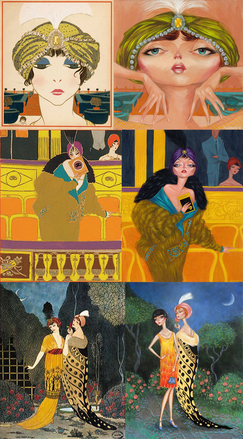 This summer I wanted to do a project in acrylic to use up some of the remaining boards I had lying around before I moved to Raleigh. I ended up with 3 paintings based on vintage illustrations from fashion house Poiret. The illustrations date from around 1910 and are done by Paul Iribe & George LePape, who were commissioned over many years to create drawings of the Poiret fashions. This is a topic I touched back in 2006 when I was working on my senior thesis for my BFA in illustration. Similarly, I created 3 illustrations based on the fashion of Poiret. This time, however, it was far more homage because I used the existing compositions & color palettes from the Iribe/LePape images. While I made quite a few changes, the similarities are uncanny. The image below shows my paintings on the right next to their inspirations.
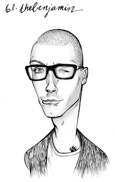
 I've been playing around with ZBrush today, getting pumped up for the 3D stuff I'm undoubtedly going to have to do in the coming weeks when classes start. Here's a head I spent a couple hours "sculpting." I haven't figured out out to use more than one object yet, so I wasn't able to use spheres for his eyeballs. Next time!
 Here's a little painting I did for fun over the past week. It's what I imagine the puppy that I had last summer might look like today. I gave him back to my mother, who is a dog breeder, which hopefully doesn't sound too heartless. He really was the love of my life for the week I had him, but the idea of leaving him in a cage in my apartment during my 9-5 was too much to bear. (how boring!) He ended up going with his puppy brother to a home with two little old ladies that probably give him a whole lot of love. And plenty of cigarettes?
 Just got my CS5 Master Suite in the mail last night and wanted to play around with Photoshop's new features. I think the new settings with the brush are pretty cool, but really not all that life altering. I tried my best to use them in this image, but don't like the result as much as the process I've been developing with the previous versions' more limited capabilities. Basically you get some stringier looking brushes and the ability to pick up color that is already on the canvas with a new "mixer brush."
 Here's the last two. It feels great to be finished with this project, as it's been a year and a half in the works. Some times it was like a weight on my shoulder, calling me to finish it and others it was a great way to express some creativity on the fly... I started it for a couple reasons:


 Painted this little lady in the afternoon after finishing some real work. Was tons of fun to just paint something and not care too much about the result! (meanwhile, two almost-finished acrylic paintings are staring me down begging for those final all-important brushstrokes).


 Here's a painting I did, meant to be the third in the set with Handhearts & XYZach. I don't think it fits, though, so I'll do something else!