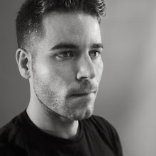
August 1, 2007: I updated this painting tonight after looking at some more pics of Hugh Dancy. I thought his hair looked too perfect and wanted to lighten his eyes (among a few other small changes). I think it looks a little more like him now.

Here's a new one that I did today. It's Hugh Dancy--a gentleman that was most recently in the film "Evening." While Mr. Dancy may be alarming, the film is not. Anyway, this was fun, and I feel like I'm really getting to where I want to be. I'm most happy with the how I'm getting more expressive with brush strokes and willing to let that show in my work. (I'd still like to let it show more, but I think that will come with time)
 August 1, 2007: I updated this painting tonight after looking at some more pics of Hugh Dancy. I thought his hair looked too perfect and wanted to lighten his eyes (among a few other small changes). I think it looks a little more like him now.
 Here's a new one that I did today. It's Hugh Dancy--a gentleman that was most recently in the film "Evening." While Mr. Dancy may be alarming, the film is not. Anyway, this was fun, and I feel like I'm really getting to where I want to be. I'm most happy with the how I'm getting more expressive with brush strokes and willing to let that show in my work. (I'd still like to let it show more, but I think that will come with time)


