Here's a promo piece I just finished. The styling is inspired by the 80 Dlist Boys project, but I wanted to be a little more expressive with brushwork.


 I'm so backlogged on this project - I finished these a few months ago and kind of forgot about them. Definitely not the best in the series, I think that they perfectly capture how cornered I was feeling with this series, where each new drawing fit a formula. I took a break somewhere in the middle of drawing Braulio and finished him last month. I'm trying to be looser and freer with the new additions.
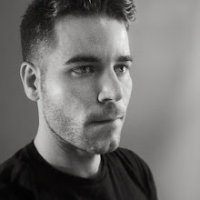
 Here's the mischievous Peter Campbell. This one was fun - first time using Photoshop CS4 & my new MacBookPro. I felt a greater sensitivity and response with the brush tool, which is very exciting.
 I like this a lot, but I want to capture Betty Draper just a little younger looking.
 Here's Don. This was a second try, the original is below. I think part of the reason I had so much trouble with him is because he's known for being a very handsome man and it is hard to retain that handsomeness while exaggerating his more pronounced features. I also want to point out that Liz Lemon on 30 Rock says, "he looks like "a cartoon pilot." How do you tell if a large chin is "cartoon pilot" or "Jay Leno?"
 I also did one of Don Draper, but it became to sculpted and real. I'm happy, however, with the simplicity of this one.
 Here's Joan Holloway! I was at this point in the middle where it was so perfect and graphic and retro. I want to start minimizing.
 I decided to completely redraw the artwork on this one by hand (the original was done on a cintiq). I like the looseness and the gesture in the original, but it wasn't what I pictured for this project. I don't think I've ever redrawn something without making major changes to it, so this was a challenge. Knowing that I was more or less repeating a previous action. And, FYI, I never want to draw chains or railroad again.
 You can see the process above (thumbnail drawing, rough sketch, Final A, Final B).
 Saw Inglourious Basterds last week - what a great flick. Highly recommended. Here's my rendition of Lt. Aldo Raine.
 I drew this yesterday during breaks from a lengthy & tedious graphic design project, and colored it today. I'm happy with the way it turned out--just as I imagined it when I drew the sketch a few months ago. This CD is all about nature and animals (plus lots of twisters). There is also a really lovely song called "Prison Girls" that inspired the girl.
 Here is the final artwork. The idea behind this drawing is based mostly off of the first song on the disc, "Margaret vs. Pauline" which is about how everything is so easy for Pauline, while poor Margaret keeps getting the short end of the stick. I blended this with little bits and pieces from all the other songs to create the whole narrative, with Margaret being the victim of the car crash in "Star Witness".
 Here's an in-progress on the drawing for my Fox Confessor Bring the Flood album art. It's done in the style of the DList boys project - which is a divergence from the inky free style way that I did the Tigers Have Spoken. I'm not sure if this was the right choice - kind of wishing I went looser, but I'll finish and see how I like it then.
 I have finally finished, after more than a year sitting on the shelf, my painting of Saint Scholastica. It feels so good to have this little weight off my shoulders, I must say. It's also interesting to look at this and see a couple stylistic approaches that I was veering towards last year and have now moved away from.