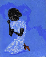
Here's a little painting I did for fun over the past week. It's what I imagine the puppy that I had last summer might look like today. I gave him back to my mother, who is a dog breeder, which hopefully doesn't sound too heartless. He really was the love of my life for the week I had him, but the idea of leaving him in a cage in my apartment during my 9-5 was too much to bear. (how boring!) He ended up going with his puppy brother to a home with two little old ladies that probably give him a whole lot of love. And plenty of cigarettes?
...Anyway I had finished the clothing part and then almost scrapped the painting because I was running out of time (more on that below) but really his face and arms wasn't so hard. I also have been wanting to spray a matte finish on something and then put a high gloss varnish in certain areas on a painting for a while, so this was a good opportunity to test it out. Although you can't see in this digital image AT ALL, I glossed the "smoke" and his eyes and nose. It's a cool effect that I'll use again.
Now the other part is that I'm moving to Raleigh tomorrow to embark on a new adventure: the graduate animation program at North Carolina State University. Wish me luck!
Thursday, July 29, 2010
Saturday, July 10, 2010
CS5 Play
Just got my CS5 Master Suite in the mail last night and wanted to play around with Photoshop's new features. I think the new settings with the brush are pretty cool, but really not all that life altering. I tried my best to use them in this image, but don't like the result as much as the process I've been developing with the previous versions' more limited capabilities. Basically you get some stringier looking brushes and the ability to pick up color that is already on the canvas with a new "mixer brush."
Overall, the software loads quicker and feels more responsive, but on the other end of that is too sensitive and feels a bit glitchy compared to CS4. For instance, I kept accidentally moving or closing my palettes when I was just trying to access them--something that's never happened to me in past versions even thought the interface is the exact same thing. The canvas is a little jumpy when zooming/panning as well. BLERG. (Also played around with the "content-aware fill" which is far less cool than what it was made out to be)
Saturday, July 03, 2010
80 Dlist Boys: Clavicle & Reed. THE END
Here's the last two. It feels great to be finished with this project, as it's been a year and a half in the works. Some times it was like a weight on my shoulder, calling me to finish it and others it was a great way to express some creativity on the fly... I started it for a couple reasons:
- I wanted to practice mark making and become more confident in my marks.
- An opportunity to play with portraiture and test the limits of distortion against recognition. Sometimes it works and sometimes it doesn't but because this was a sketchbook project it was easy for me to not get hung up on the guffaws.
- Playing with beauty... how is it that these 80 men can all be beautiful but all be so very different looking? As my friend Maggie said about the difference between faces, "it's all about the spacing."
- A productive time waster: when I started this I had a hole in my schedule everyday that I needed to fill.
Labels:
80 Dlist Boys,
distortion,
drawing,
male,
portrait,
sketch
Subscribe to:
Posts (Atom)