Showing posts with label photoshop. Show all posts
Sunday, August 12, 2012
Mug
Just completed an illustration for John O'Marra's poem book, Chocolate Chips and Rocket Ships. This is such a cool project: 100 poems illustrated by 100 different artists. Check it out!
This is the first thing I've really made since my move to Columbus. It's totally great here, and I even have a huge room entirely devoted to being a studio space. Attached is a not very glamorous photo of what part of that space looks like, BUT I LOVE IT!
Friday, June 15, 2012
Her Heart Was Bionic
I've wanted to do some Anna / Gaston "movie posters" for some time now. I have a few more ideas in the works, but here is the first one, inspired by the poster for "This Gun For Hire."
Sunday, May 13, 2012
Saturday, May 12, 2012
Wednesday, May 09, 2012
Future Worlds Character Updates
One more iteration on the Future Worlds avatars. We decided that the female characters from my previous version needed to be cuter to appeal to the pre-teen audience plus a couple little changes on the other characters to make them more cohesive.
Monday, May 07, 2012
Future Worlds Character Designs
Here are a couple iterations of character designs for a game we are making at Intellimedia. The game will be delivered on a giant touch screen and can be played by several children at the same time. These are possibilites for the avatars the children can choose from.
Originally I had designed these amorphic blobs and creatures based on themes from the game. After getting feedback from the team it was decided to take the shapes of the blobs and make them into human superheroes.
Labels:
character design,
concept,
future worlds,
photoshop,
sketch
Tuesday, October 25, 2011
More textures for Buster.
Been working on his suit and jetpack. Having a lot of fun with bump & spec maps (plus dialing in the blinn settings).


Labels:
buster,
game project,
photoshop,
render,
texture
Monday, January 10, 2011
Lady in White
Here's a quick study for an expansive project I'm working on. The plan is to make a little story out of three illustrations drawn & rendered in Maya. (Kind of like Ray Caesar) I want to do something retro/futuristic with spies and robots. Have a big plan and lots of inspirational images but don't know exactly what it will look like yet...On another note I was afraid that I was forgetting how to digital-paint, as it's been several months since I've tried. I'm glad I haven't completely lost it!
Thursday, December 02, 2010
Saturday, July 10, 2010
CS5 Play
Just got my CS5 Master Suite in the mail last night and wanted to play around with Photoshop's new features. I think the new settings with the brush are pretty cool, but really not all that life altering. I tried my best to use them in this image, but don't like the result as much as the process I've been developing with the previous versions' more limited capabilities. Basically you get some stringier looking brushes and the ability to pick up color that is already on the canvas with a new "mixer brush."Overall, the software loads quicker and feels more responsive, but on the other end of that is too sensitive and feels a bit glitchy compared to CS4. For instance, I kept accidentally moving or closing my palettes when I was just trying to access them--something that's never happened to me in past versions even thought the interface is the exact same thing. The canvas is a little jumpy when zooming/panning as well. BLERG. (Also played around with the "content-aware fill" which is far less cool than what it was made out to be)
Tuesday, May 11, 2010
Clavicle
Here's a painting I did, meant to be the third in the set with Handhearts & XYZach. I don't think it fits, though, so I'll do something else!
Labels:
distortion,
male,
painting,
photoshop,
portrait
Thursday, April 22, 2010
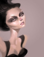
Unity Mitford
Here's a little study I've been playing with of the stone cold Unity Mitford. She's from a British family of 6 sisters that lived the entire span of the 20th century and were rather famous socialites in the 1030's. Unity in particular was an avid Nazi who shot herself in the head the day Britain declared war on Germany. I've been working on traditional paintings of the more wholesome sisters and this was just to get in the mood.
Labels:
distortion,
female,
mitford,
photoshop,
portrait
Monday, March 01, 2010
The Great Gatsby
This is from a book-cover project I started in October and just finally decided to finish. Below are process, including the first color sketch which included a belly-band that would be templated for use on other classic book titles. I decided that it would be more fun to incorporate the text into the illustration instead, plus pushed the color palette more towards the fantasy realm.

Sunday, February 21, 2010
Logan Lynn: Feed Me to the Wolves

Here's a painting I did of a musician named Logan Lynn. I'm also including the process because it might be interesting to someone out there.
Friday, February 05, 2010
Monday, February 01, 2010
Handhearts
Here is a little painting I've been working on for fun. Inspired by a photo of a Dlist Boy named "handhearts." This actually fits perfect as my annual "red-haired" winter painting and it's fun to see how I've grown in four years. Here are the previous:Saturday, January 23, 2010
A Single Man (or Single Lady in this case?)
Here's Julianne Moore from her new film, "A Single Man." Does anyone know why Julianne Moore only take roles in films set in the 1950's and 1960's? Not to say that she isn't great in them, but it just seems curious.Many apologies, also, for neglecting my blog. I did some traveling during the Christmastime and just haven't had much time to produce. I do have 4 or 5 new Dlist Boys, though, that I will roll out in the next few days.
Labels:
celebrity,
distortion,
female,
one-hour,
photoshop
Monday, November 23, 2009
Seasons Greetings!
Here's my new Gocco card. It looks better in person because it's in silver and metallic blue ink (sparkly!) I'm also showing my process here. The first image is the thumbnail that I drew and colored to provide a road map for this project. The second image is the ink drawing, colored in with the appropriate ink colors, and the third image is the actual screen printed card. You can see how different the print is from the screen artwork because the way the ink bleeds and the offset from the two color process.


Tuesday, October 20, 2009
Subscribe to:
Posts (Atom)