Showing posts with label color. Show all posts

Tuesday, July 24, 2012

New Beginnings

I've spent the last month moving from Raleigh to Columbus to start teaching full-time as an assistant professor at CCAD. So far Columbus has been great - lots of good food, good people, cool stores (can you believe there is a stationery store just blocks from my apartment?!) After four weeks, my belongings still haven't been delivered to me thanks to those bastards at American Van Lines, but that hasn't stopped me from buying all new art supplies and making some paintings to adorn the many many walls in my apartment. Feels great to use traditional media. It's been such a long long time. These were modeled from vintage photos of Catherine Deneuve and Alain Delon that I googled.


Friday, June 15, 2012

Her Heart Was Bionic

I've wanted to do some Anna / Gaston "movie posters" for some time now.  I have a few more ideas in the works, but here is the first one, inspired by the poster for "This Gun For Hire."


Saturday, January 28, 2012

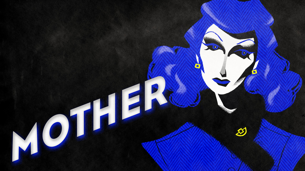
A few Mother images.

Here are some sneak peeks at my work in progress, "Mother." My thesis review date is March 27th which I am nervously anticipating. Just finishing will be a miracle.

Sunday, October 30, 2011

Even More Mother Concept Art

Some typography explorations and a test render of Anna that I made with Maya, Mudbox, and AfterEffects. The result is coolish, but I think I'd rather draw the characters by hand than use 3d models. The process I used to achieve the flattened effect was to use toon shaders with a highly-detailed bump map (to pick up the strands in her hair) and then in AfterEffects split all the color layers and reassemble them like a screen-print.

Sunday, October 23, 2011

More Mother Concept Art


Played around with graphic interpretations of the Mother and Gaston characters for the flashback scenes... not loving these! More work to be done.

Also did a test animation using some 3D renders. Kind of like the result. Here's the before & after.

Sunday, October 16, 2011

A slew of new things.

Have been busy with my graduate animation project making and revising and revising again. Here are some images and type treatments that I'm playing with right now.

Wednesday, September 28, 2011

Gaston

A little inspiration for a scene in my final project. Wanted to see how a comic-bookier feel might work. Referenced the ending of Moontide.

Wednesday, September 21, 2011

La Femme

Another play on Cassandre. This time just using his palette. Very inspired right now by 80+ year old model, Carmen Dell-Orefice.

Sunday, September 11, 2011

Upgrade

Got some feedback on my character lineups. The consensus was that the first character I should model should be the Spaceman because he is the protagonist but that the current design is too simple and boring. In revisiting his design I wanted to do two things:
  1. Enhance the distortion in the figure for a more unique silhouette.
  2. Add lots of detailing to his costume.
I went back to my research and did a bunch of sketching and came up with this. (Special thanks to this amazing Flash Gordon book I picked up at the library with hundreds of photos from the film serials) I think it still recalls the military uniform that I was going for but feels a little more high-tech and has lots of little things to look at. He ended up with a creepy sneer in the painting which I will avoid in the actual model.

Thursday, March 10, 2011

Raptor II: Texturing

This is my product from a painting/texturing demo on Digital Tutors. So exciting to compare the hand-painted textures/bump/spec maps on this to the original process-texture version that I did a few weeks ago!

Saturday, January 29, 2011

Noir!

These are some concept pieces I did for a team project in my animation class. My partner and I will be creating a looping animation that pulls the viewer through a day in the life of a private investigator.

Saturday, January 22, 2011

Thumbs & Color Studies

Here are some sketches that I did in preparation for the project I'll be building. I also did color studies of my 3 favorite scenes. I really want to do an image of the dog & females characters on the top of a building as well, but don't want to make an impossible amount of work for myself. I'm trying to incorporate a wide variety of materials (glass, fabric, metal, etc) into each image.

The characters that I'm working with are:

The Inventor: the father figure, inventor, and spy handler
The Android: a robot femme fatale designed in the image of the Inventor's mother
The Puppy: the Inventor's adopted son

Saturday, October 30, 2010

Winning the Oil Endgame: Style

Here's some parts and pieces I'm working on for my next animation project, called "Winning the Oil Endgame." It's based on a TED talk of the same name. I motif for the animation will be board games, hodge-podging elements from Risk, Monopoly, and the Game of Life.

Monday, September 27, 2010

Animation Color Keys

Making major headway on my autobiographical animation. Worked out some of the details in my storyboard and did color keys for the whole thing. I didn't actually HAVE to do this step, but I see professional animation studios doing it and it just looks fun! I feel like I could refine these little drawings and have a storybook. I also feel like this simple retro style would be perfect for the animation all by itself! But the assignment is to do a puppet-show-theater style thing with a shallow depth of field, and that's what I'm going to do!

Also, here's the first set (of the neighborhood from the childhood scene) rigged & lit in After Effects. I tried to make it look like the set it built out of different kinds of paper and painted finishes. The whole thing should end up looking somewhat handmade. If you look at this and the little boy puppet from my last post you can get a pretty good feeling for the look of the film.

Monday, November 23, 2009

Seasons Greetings!

Here's my new Gocco card. It looks better in person because it's in silver and metallic blue ink (sparkly!) I'm also showing my process here. The first image is the thumbnail that I drew and colored to provide a road map for this project. The second image is the ink drawing, colored in with the appropriate ink colors, and the third image is the actual screen printed card. You can see how different the print is from the screen artwork because the way the ink bleeds and the offset from the two color process.

Thursday, June 04, 2009

Neko Case Project: "Tigers" Final?

Here's my final colors for The Tigers Have Spoken. Now I need to finish the other five albums to complete the set! I'm putting the finishing "inks" (done completely with my Wacom) - I think it looks better in black and white.

Tuesday, April 28, 2009

Neko Case Project II: Roughs

Here are the first three roughs for Tigers Have Spoken, Fox Confessor Brings the Flood, and Middle Cyclone. I still have to research the other three albums but these roughs give me a better idea of where I'm headed. Each image will be done in black, gray, and one color. I'm so excited about how loose and energetic these sketches are. I definitely want to keep that energy in the final art. (I almost just want to keep tightening these sketches and call it a day!)

Monday, April 27, 2009

Neko Case Project

I assigned myself a fun little project: I'm going to illustrate 6 Neko Case album covers, weaving a narrative out of the wonderful imagery she creates in her songs. I also want to make this a bit about branding and package design. Here are my thoughts thus far. I think I want to render them much in the same style as the 80 Dlist Boys. Black and white penwork with a premium on hand-drawn texture and color accents.

Monday, February 16, 2009

Seagulls Fly at Midnight

Watch out, because danger lurks around every corner. No secret is safe. My newest Gocco card is spy themed!

And for those of you that still don't know what gocco is, its a wonderful Japanese screen-printing process. Check out this video to see how some professionals diy it! I do it a little differently then they do, but it's the same materials so you get the gist.

Friday, January 16, 2009

Valentines Card


I made a Valentine's Day card with my Print Gocco. I thought it might be interesting to show the process of how I create this type of work. The first thing I do is come up with a sketch. Since the Gocco is a screen-printing process, I know I'll be limited in my color. Because of this, it's really important to decide how and where I'll be using color before I start drawing. Doing this lets me easily figure out where to put solid blocks of color, how much detail I'll need in particular areas, etc. Depending on the materials at hand, I might do the color study with markers or quickly in Photoshop.

The next thing I do is enlarge my sketch on a photocopier and then trace over it with a lighttable. This will be a simple black and white drawing. Sometimes I might draw certain elements on different pieces of paper and scan them in separately if it's easier to do that than separate in Photoshop.

The next step can be pretty complicated because I have to finish my artwork digitally (such as reversing the bricks) and separate the linework into two color plates. I use a lot of layers and channels to do this. Here are my final plates, which I print on a carbon-based printer and then burn my screens with.


Then I burn my screens and print. The final result looks like this! If you like it, go to my etsy shop and get some to give to your special friends. (The image at the top of the post is a Photoshop rendition that digitally applies the qualities of a print).