Showing posts with label fashion. Show all posts

Sunday, April 10, 2011

Art to Wear

Been working for the past couple months on the multimedia portion of Art to Wear at NC State. It's a fashion show hosted by the College of Design & College of Textiles. The event takes place Tuesday at 7pm. Come if you are in the Raleigh area.

In a strange twist of fate I ALSO ended up making the logo (see my rejected logo entry here.) This was an unusual "collaborative" process since I was given an existing logo and several graphic treatments and asked to create something new while re-purposing certain elements. The frame, typography, and Art Nouveau style came from the logo I was given but have been altered to fit my drawing style.

Friday, January 21, 2011

Art to Wear Reject

Here's my logo entry for NC State's "Art to Wear" event. It didn't win, but I still like it! Looking forward to see the winning logo.

Monday, August 16, 2010

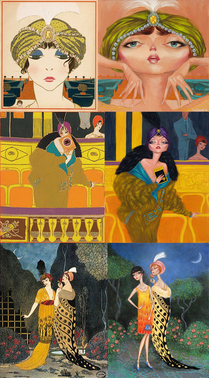
Paul Poiret

This summer I wanted to do a project in acrylic to use up some of the remaining boards I had lying around before I moved to Raleigh. I ended up with 3 paintings based on vintage illustrations from fashion house Poiret. The illustrations date from around 1910 and are done by Paul Iribe & George LePape, who were commissioned over many years to create drawings of the Poiret fashions. This is a topic I touched back in 2006 when I was working on my senior thesis for my BFA in illustration. Similarly, I created 3 illustrations based on the fashion of Poiret. This time, however, it was far more homage because I used the existing compositions & color palettes from the Iribe/LePape images. While I made quite a few changes, the similarities are uncanny. The image below shows my paintings on the right next to their inspirations.

Wednesday, April 07, 2010

White

Here are some fashion studies I did a week ago. First time I've painted traditionally in several months... felt good!

Thursday, July 30, 2009

Starlet

Here's a little something I whipped up. (I haven't painted in several weeks, so it seemed like a good thing to do)

Friday, May 29, 2009

Watercolor

I wanted to see if I could accurately mimic the appearance of watercolor in Photoshop, so I played around with this. I made a couple custom brushes that "bleed" and applied a watercolor paper-like texture to the washy layers I created. Simple pleasures: my favorite part is the white necklace that looks as though it was painted with thinned white-out.

Sunday, March 01, 2009

Missoni Spring 2009

Here's a companion piece I started back in December to the Prada Cats. I might finish the set with some Lanvin or Vuitton. We'll see. It's acrylic on wood panel with black ink. I'm also considering putting some gold on the jewelry areas, but we'll see about that! The second image is the color study.

The dresses are from Missoni's Spring 2009 line. I thought that this was a gorgeous collection that paired a few different ideas about texture & textiles with some fantastic solid colors on some fresh silhouettes. I picked three ensembles that showed the full story of the collection. My favorite part is the cubist pattern of grays, pinks, yellows and turquoise that I got to paint underneath the linework on the second bird lady. Below are the actual dresses (photos from Style.com used without permission)

Saturday, February 14, 2009

Francis

Here's a portrait I did of my nana for an event at the Milwaukee Art Museum, "Jan Lievens on a Jet Plane". The assignment was to take a Lievens piece and reinterpret it in my own style with my own subject. I chose his portrait of Rembrant's mother.

Sunday, January 11, 2009

Wednesday, December 17, 2008

Prada's Spring 2008 looks on some Pretty Kitties

Acrylic and Ink on 12x16 panel. Also, have a look at the color study. The scan unfortunately doesn't do the piece justice, as this panel really glows in life.

Thursday, December 04, 2008

Yves St. Laurent - Fall 2008 Men

Here's a little sketch I did of a couple photos lying on my desk.

Sunday, November 09, 2008

Scholastica Landcut & Redman

Scholastica Landcut is not quite finished - there's a couple little things I've been meaning to do to this one.

And here's a crop-in on a canvas I started this morning. I love how much natural media glows. These are both so much more stunning in real life.

You'll notice all the unfinished projects that I've shown in the last month or so: I've actually never had so many open projects going at once in my life. I'm the type of person that's very quick to resolve something, so it's feeling very fresh and invigorating to start and end things as I'm inspired to.

Sunday, September 21, 2008

Update

There's a few more things I'd like to do with this, but here is my progress so far.

Friday, September 19, 2008

I feel so sad...

...that I haven't posted in FOREVER. So here is something I whipped up just for you! It's a work in progress.

Thursday, May 22, 2008

Audrey Redcoat

More fun with watercolors. This is the sister act to "Black Eyed Susan." It quickly turned into a sampler of watercolor technique, I think the only thing I didn't do was throw salt on it! My favorite part is the variegation in the stockings... I think my next watercolor will be less controlled.

I've been watching Twin Peaks like a madman lately, and it couldn't have come at a better time because the women in that show are perfect models for these lusty ladies of vice. While I conceived of this project a week or so before I began watching the show, I can't help but notice the similarities between to two: a throwback to retro-Americana & mystery. And lots and lots of cigarettes. This one was going to have wilder hair, but I reined it back in as a tribute to Audrey Horne of Horne's department stores.

Wednesday, April 30, 2008

Black Eyed Susan

Here's the water color painting I've been wanting to do for some time. I don't mean this subject, I just mean A watercolor painting! This bares some similarity to the post below in that this is the first time I've used water colors in over 4 years, so I'm not terribly confident with the media, but I just went for it. I'm pretty happy with the results... Of course water color is just about the least forgiving of the painting medias, so certainly there are a few things I don't love about this. First off, the stems of the flowers got way too thick and would have benefited from being more delicate. I also think I her hands lack grace. Next time I'll get it right! This was just an experiment after all!

Things I DO like about it:
1. Watercolor is such a loose medium! Even the tight lines I made did their own thing. (Her lips started bleeding, for instance). This adds a lot of character that a digital painting would never have.
2. I love the source material I got this dress from... those lines on the skirt are just perfect for this application. The dress from a book called "Vintage Fashion" and was designed by Texan Tom Brigance in 1952.
3. The use of white space and using the paper as a color.
Also, perhaps this will be interesting, but everything about this piece was planned before I began painting. I made a quick color study in Photoshop so that I wouldn't make any foolish choices when it came to the final. I'm REALLY happy I did this because I changed a few things around getting to this particular color combination.

Saturday, March 29, 2008

This makes me giggle.

I didn't realize, until completely finishing, that the lighting on the figure is incongruent with the shadows cast behind him. Bad artist... all I was thinking about was how I compositionally wanted the shadows to fall and what it would do to the psychology of the piece. I kind of like that it doesn't match... I don't know if it's terribly obvious beyond creating discomfort within the reality of the piece.

The pose is from a Gant ad.

And, I decided to fix the new Red Haired Girl... Looking at her the day after I painted it, I realized that her hair wasn't really what I had envisioned it... the original plan was for it to be big and wild, and it ended up being quite short. So, here's an update. I think it's improved. I also think the technique is a little nicer... the hair in the original piece is a little too evenly painted. I was trying to do this a little more painterly and with some degree of emphasis and randomness.

Thursday, March 27, 2008

A New Red-Haired Girl for a New Age.

Another model... this time, however, the only thing I'm borrowing is the pose, from the lovely Jessica Stam as featured in the April 2008 Vogue. This feels a lot more satisfying knowing that I invented the colors, the clothes, and the hair. Feels a lot like my senior thesis project, actually, just quicker and (cough) more interesting.

It is also only coincidence that this completes a trio of complementary colored paintings (see yesterday's post, and the day before that). I don't think this piece really goes with the other two. When you compare it to Daria (March 25) it looks so breezy and fun. I'd like to do something darker, though. We'll see.

AND, what's more fun is that this kind of reinvents "Red Haired Girl" for me. Just a little over a year since. Maybe every winter I can do a new Red Haired Girl?

AND one more and... a gift for Tina! Here's that sunburst texture... It's just something I found. As I'm sure anyone with a keen eye has noticed, I've used the exact same texture overlays for the last three paintings on here. It's a combo of this swirly texture I found, a bumpy gesso texture I made (and use in almost everything I do... time for a new one?), some hand-written journal I found, and a light bumpy texture. I've been noticing a trend in digital art that leans toward the use of layers upon layers of texture that add an extra level of depth that will generally always be lacking in this media. (even though this is the gimmickiest of gimmicks.)

Wednesday, March 26, 2008

Calvin Klein

Here's another fun little diddy I did tonight. So excited to be doing some art again in my free time. Something got away from me these last 2 months and I've just been laying around watching TV (perhaps I should have kept this to myself?).

Anyway, this is the same deal as yesterday: used a photo from a CK ad. Although this time, the colors are entirely mine. And the composition too. I cropped in a bit and moved him over to the left. I like these strange asymmetrical comps where the character appears to be moving out of the field of vision. Adds to the story.

Definitely inspired by the colors I used yesterday. In classic Adam Osgood Technicolor dream coat fashion... Do I dare paint someone in a shocking blue sweater tomorrow?

Tuesday, March 25, 2008

New Painting

Here's a quickie I did tonight... first time I've "painted" since... Oh I don't know January, I suppose. I'm happy I took a break... started off really refreshed, made some bold moves with application and most of all: had fun! It's based on a photo in the March 2008 Vogue of model, Daria Werbowy. Here's a question: if this painted from a photograph, but is just as much about my hand as it is the subject, does the painting become mine, or is it still the intellectual property of the photographer?

From the bottom of my heart, I know that this will never be mine, but I've heard about changing the source material to a certain degree and then it being considered original. Anyway, I merely ask just to feel okay about putting something like this in my portfolio as a display of technical skill.